
Typography Resource
Typography Pairing Library
Good typography rarely feels accidental. The Typography Pairing Library is a meticulously organized digital reference built for designers who want type combinations that feel intentional, commercially credible, and visually refined from the first mockup onward. ✦
The Typography Pairing Library is designed for graphic designers, brand strategists, editorial creatives, and web designers who know that typography is one of the fastest ways to elevate or weaken a visual identity. A strong type pairing can make a brand feel modern, classic, sophisticated, directional, luxurious, technical, approachable, or editorially sharp. A weak one can make even a good concept feel uncertain or unfinished.
This digital library is built to remove that guesswork. Instead of testing endless font combinations manually or relying on inspiration alone, you get a professionally structured reference system that shows how pairings behave in actual design hierarchies. It helps you evaluate not only whether two typefaces “look nice” together, but whether they communicate the right tone, support a functional hierarchy, and fit the demands of commercial design work.
Whether you are building a brand identity, refining a website UI, creating packaging concepts, laying out an editorial spread, or preparing client presentation boards, this library gives you a more confident starting point for choosing typography with taste, clarity, and purpose.
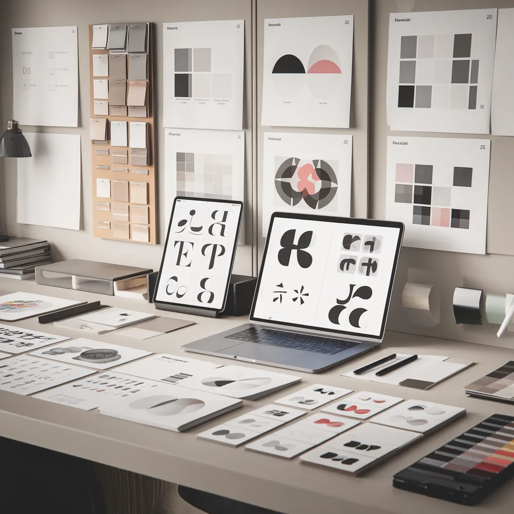
Inside the library
Choose with more confidence
Stop relying on guesswork or endless comparison tabs. Use a tested reference library to select pairings that already feel coherent, polished, and professionally grounded.
See hierarchy in action
Evaluate how a pairing works across real typographic roles, not just on a font name list. That makes the selection process far more useful in actual design execution.
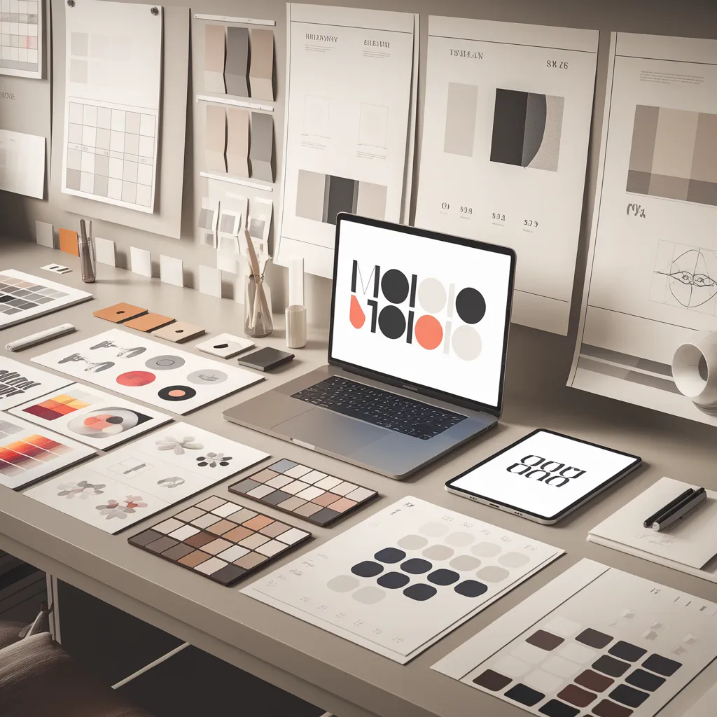
Match type to brand tone
Use mood and classification notes to align typography choices with the emotional and strategic direction of the brand or publication.
Why this resource is especially valuable
Typography choices often carry more brand weight than people realize. Before layout grids, color systems, or imagery fully register, type is already shaping how a project feels. A library like this helps designers make those decisions with more precision, whether they are aiming for luxury restraint, editorial sophistication, clean corporate clarity, or strong modern contrast.
How it improves real design workflows
In commercial work, typography decisions need to happen quickly but still feel well considered. This library helps shorten that decision cycle without lowering quality. Designers can move from concept to execution faster because they are working from curated options instead of improvising every pairing from zero.
That makes it especially useful in branding workflows, client proposal stages, web design systems, social campaign assets, publication design, and creative direction work where typography has to support both visual personality and practical readability.
Built for designers who care about type as a system
This is not just a visual inspiration pack. It is a structured design reference for people who understand that typography affects tone, trust, readability, hierarchy, and overall brand perception. It supports better decisions not only at the aesthetic level, but at the strategic level too.
That makes it highly useful for graphic designers, brand strategists, editorial designers, creative directors, and web designers who want a more refined and efficient way to choose pairings that feel purposeful in real-world commercial design settings.
Ideal use cases
Use the library while building visual identities, selecting type systems for websites, planning editorial layouts, developing client moodboards, refining brand guidelines, or preparing polished design concepts that need stronger typographic direction.
It is particularly helpful when you need type combinations that feel not only attractive, but commercially appropriate and strategically aligned.
Digital product only
This is a digital product only. No physical item will be shipped. After purchase, you will receive access to the downloadable library files for immediate use in branding, editorial, and web design workflows.
Reviews
There are no reviews yet.